Company Logos with Hidden Meanings
The five logos in the video below have interesting hidden meanings that may go unnoticed on first glance. Some of the logos seem basic, or uninspired. However, in reality they are the result of deep thought, and great design.
Let’s look at the five logos and their hidden meanings.
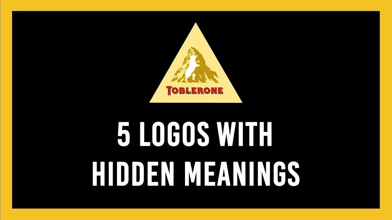
1. Toblerone

Toblerone was founded in Bern, Switzerland–a place known for its bears. Those who designed the Toblerone logo took this into account when they snuck the figure of a bear into the mountain within the logo.
2. Amazon

Amazon’s designers put together a subtle, but clever logo for Amazon. The online retailer currently has 582 million products on their site, so they’re covering everything from A to Z literally.
3. FedEx

Designed in 1994, the logo is simple and straightforward. However, if you look closer you’ll see an arrow between the E and X in the logo which is meant to represent speed and accuracy.
4. Baskin Robbins
![]()
Baskin Robbins has cleverly highlighted the fact that they have 31 flavors to choose from by sneaking in the number 31 between B and the R in the logo.
5. Tour de France
![]()
The most iconic bicycle race in the world also has one of the most clever logos. The logo actually includes a cyclist in the text.
Any other logos with hidden meanings that we didn’t mention? Let us know in the comments section below.